My portfolio showcases various projects created throughout my career. I have held my Salesforce Certification for 3 years, I have worked in financial data and analytics for 6 years and have produced data science projects for the past 2 years. I have built out custom Salesforce instances as well as wrote apex code as needed. I build custom reports for system altering forecasting models as well as reports that are used by senior leaders and shareholders.
See my contact information below and get in touch.
Skill Sets and Projects include:
- Salesforce Development
- Pardot
- Salesforce Admin work
- Excel spreadsheets with advanced formula work
- Microsoft products
- Financial analysis and forecasting
- Tableau Dashboards
- Power BI Dashboards
- Workflows and Automation of Processes
- Change management and technology adoption.
Full Analysis with Completed Visualizations


Visualizations Explained
KPI Stacked Donut
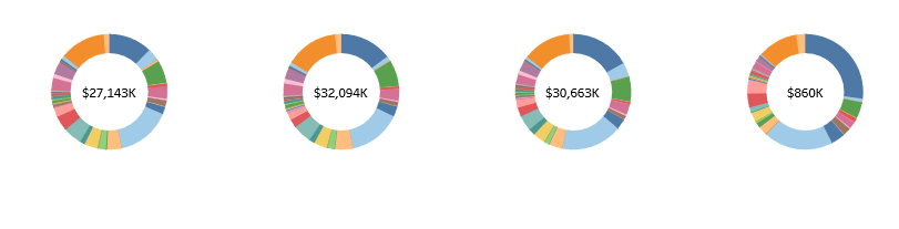
This is a Quarterly Breakdown of Sales. The center is the profit for that quarter while the outer ring in various colors is broken into segment. This was decided to give a good visual representation of that largest segment but with the focus for the company being on the overall profit.
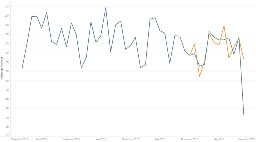
Forecast Vs Actual Overlay
This is historically driven trend line that I excluded the current years data to create an accurate forecasting model. I then included the current years data to see how accurate my forecast is.
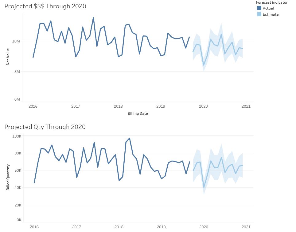
Using the Forecasting Model

Using the previously built forecasting model after the model was deemed accurate within 95%. I was able to project that forecast by include the current years data and moving that out into the future.
Heat Map

This is one month of data displayed in a heat map. This shows the highest profitability of the U.S. states that were shipped to in that month as well as the total number of units shipped as an overlay.
Let’s build something together.
Candace DiGuilio
candacediguilio@yahoo.com
